
Improvement
We've Redesigned Our Target Chart for Improved Readability.

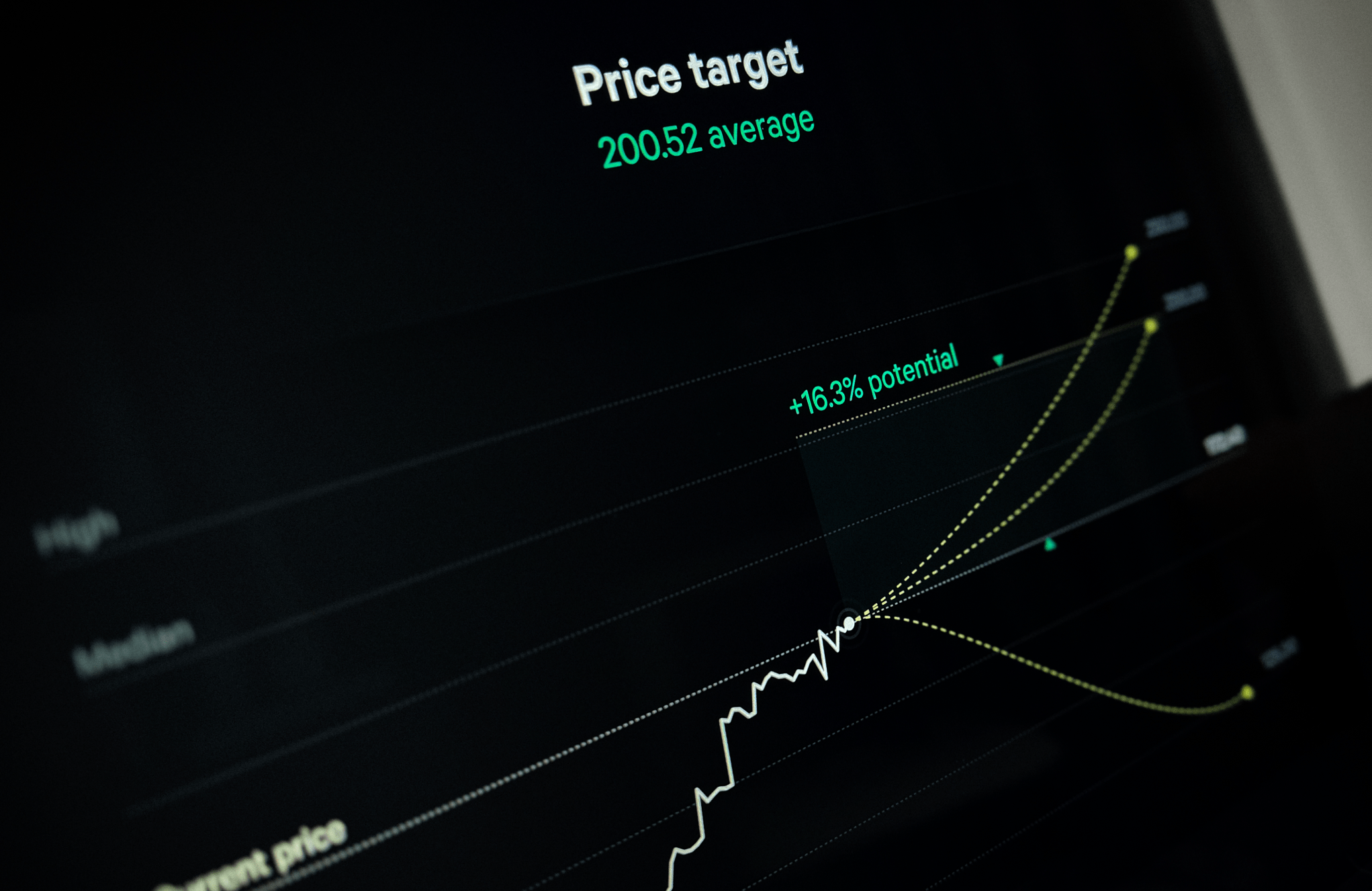
We’ve reimagined our Target chart, streamlining the design to enhance your experience.
What changed
- Unified view: No more tab-hopping! We've consolidated what used to be split across two tabs into a single, comprehensive view. Now, you can absorb all the information you need at one glance.
- Potential at a peek: To aid in your decision-making, we've introduced a visual indicator of potential percentage movement directly in the chart to give you a sense of the future.
- Aesthetic upgrade: We firmly believe that form is just as important as function. The new design is not just user-friendly – it’s beautiful. We’ve crafted a sleek interface that’s both beautiful and intuitive.
We hope these tools enhance your market research and help you make more informed decisions.